
Beauty & Cosmetics
A hair oil brand, deeply rooted in Indian hair secrets, uses natural ingredients to nourish and strengthen hair. They are cruelty-free and need a logo symbolising their USP.
Key Deliverables
Logo
Client
Reveir hair oil

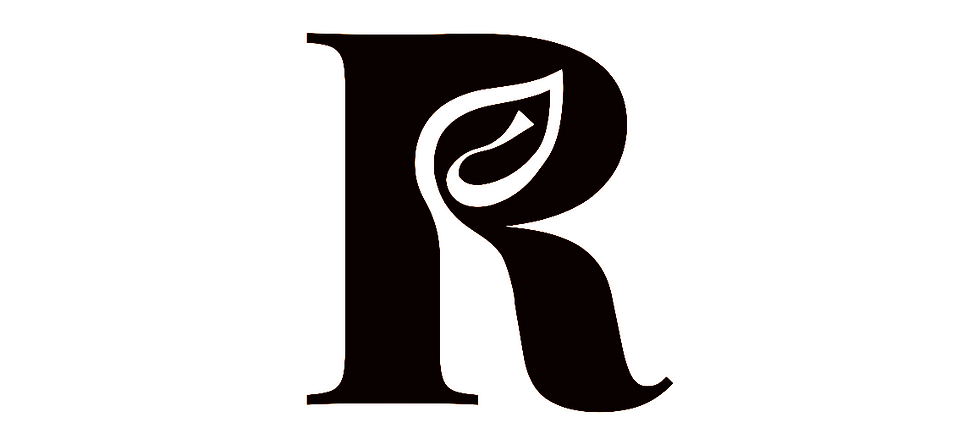
The brand’s logo is visually interesting because it incorporates a leaf in the negative space of the letter R. This design element represents the brand’s natural approach to promoting hair growth.
The dot on the i represents an oil droplet, symbolising the nourishment the brand promises to its customers. The light brown colour of the dot and the serif font contribute to a sense of luxury and maturity.


The Logo-mark
The key deliverables included a logo with variations that aligned with the brand’s voice and audience. The font, negative space, and colour palette worked together to create a visually appealing yet meaningful design. The muddy browns, oil stain brown, and neutrals bound to the design aesthetics.